


RESIDENTIAL STAGING
Every home has its own unique touch, and I aspire to emphasis this in my designs. When it comes to staging a home you need to do the opposite. You need to make the home seem welcoming to any potential buyers by giving them a blank slate with thousands of possibilities for their family.
FLOOR PLAN - BEFORE
Space isn't being utilized, bad layout
Not enough practical furniture and feels small
Rug is too small
No accessories or art on the walls
Small traffic areas
FLOOR PLAN - AFTER
Proper traffic areas
Well utilized space
Accessories
Functional furniture
Proper room division

THE HALLMAN PROJECT
Staging of the Apartment
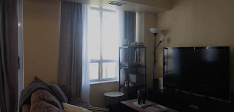
I realize that there were a few things that didn’t function. The little to no traffic areas, the lack of natural light, non-functional furniture place, lack of décor and clutter made the space seem messy and unwelcoming. The lack of art on the wall and décor didn’t make the space feel welcoming enough. A client would walk in and wouldn’t be able to see the potential of living in the space. The goal with adding more décor to the wall was to be as minimal as possible. If I put to many pictures on the wall it might give off the impression that I’m trying to hide something, such as a hole in the wall. I also want- ed to make sure that the pictures weren’t of the people living in the apartment and just something vague. I placed the frames on the empty wall. The negative space in the photo gives the room a simpler feel to it. The dining table and chairs are beautiful mid-century modern chairs with a round table however they were pretty cluttered, and the positioning of the chairs made the space feel smaller. To make sure that I used up the space as efficiently as possible, I changed the chair placement to be able to push the table as close to the wall as possible. I decluttered the tabletop and placed a simple and small vignette in the center of the table. Continuing into the living room, the furniture was not well arranged and didn’t look inviting. The owners didn’t want me to move the television, console table or the shelving unit near it therefore I had to make the television my focal point. The sofa on its own was slightly too chunky for the space especially how it was placed so I decided to turn the back of the couch to face the television. This will allow for a nice divide while still giving the small space an open feel. Originally, the space only had a couch and a very small rug. This wasn’t enough to make the space feel welcoming to potential buyers. My solution was to start by adding in a proper sized rug with mixed shades of grey. I then added a small coffee table in the center that matched the shelving unit and topped it with a vignette of books and a small statue. Throughout the space there were many warm colour tones and I thought I needed to break that up a bit. I decided to continue the flow of colors from the area rug and use throw pillows I found in other areas of the home to accent the sofa. I then added two very simple vertical picture frames to the empty wall the sofa was once facing. It adds warmth and character to the space. Finally, I added some night natural light into the dark and gloomy room by simply opening up the beautiful grey curtains. Overall, the space has much more function to it than before. There are better traffic areas that make the space feel more livable. The decor added to the room; from the picture frames to the proper sized area rug bring a feeling of home to the space.
GALLERY
Here are just a few "before" and "after" shots from this staging project.

LIVING ROOM - BEFORE
LIVING ROOM - AFTER

DINING ROOM - BEFORE
